The First Step


The goal
I wanted to figure out how to take a sketch the full journey to something more realized or to a finished state.
Candidly, I’ve never put a significant amount of time into traditional mediums to have confidence. I do love them, but it would take a much longer time table than I have to get to a professional-level of expertise. I’ve chosen the digital route because it’s low cost, forgiving, and it’s a preexisting tool that I already have (iPad, Apple Pencil, and Procreate). Easy choice for now lol.
Why is this important?
This has been my crux with illustration. I’ve always been able to draw decently, but I abandoned the final outcome. 15 years ago while at VCU, It seemed like figuring out how i wanted something to look was an insurmountable challenge. I put in some time back then to figure it out, but my patience was thin and my appetite for success was large. Well. I’m back. With more grit and determination than expectations. I want, no–I need to see this through. How can I explain it.. I need to figure out how I can make whats in my head, match with what I produce. My taste for what I wanted was always there, I just couldn’t quite get it right.
I know this will take time and practice. I’ll fail lose more than I win. But, I only need to win once to be able to replicate it. I’ll promise to learn with every attempt. So, here’s attempt number 1 with a breakdown of some thoughts I had while working on it.
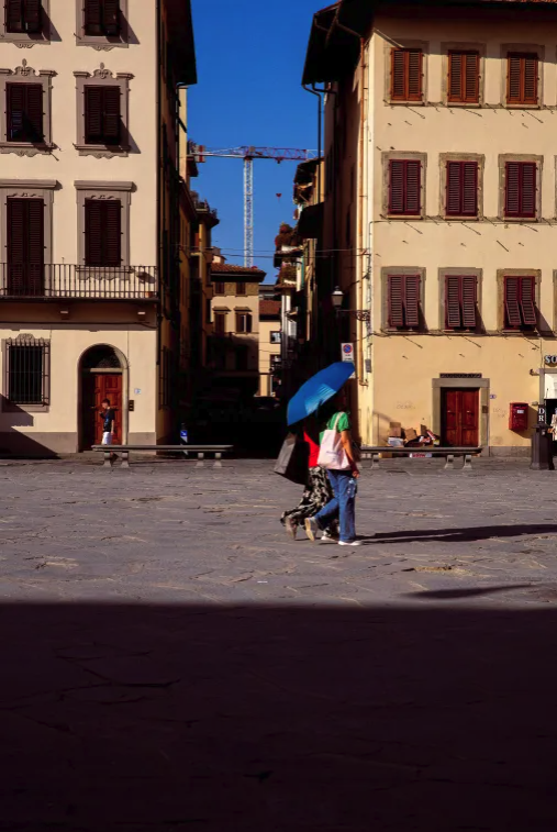
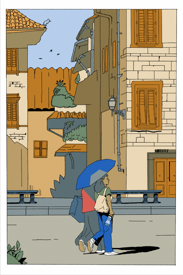
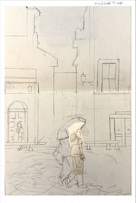
I figured I’d stop procrastinating and just try to focus on figuring out technique on something inconsequential (this time around) rather than taking time for ideation around what to draw. Keep it simple. I chose a photograph that a friend of mine took while abroad and just took it from there.

I made a very rough. I mean very rough drawing in my sketchbook and just imported it into Procreate. Looking back, I wished i did a more detailed drawing and sketch. This would’ve saved me so much time in later stages. I had to spend time figuring out visual problems when in the inking stage. Live and learn. My composition wasn’t considered and that also gave me hell.
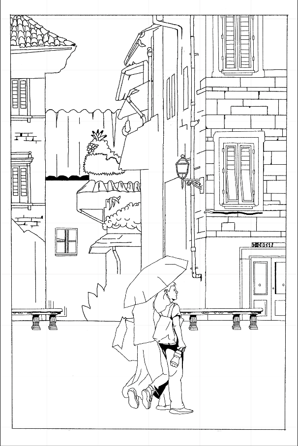
This was a little more tricky. I had to figure out what brush I wanted to use. I wanted it to still have a hand-drawn feel while keeping the line width someone honest with my preference. Too small and the lines don’t have any vibrancy, to big and then it’s clunky to me. I settled on a technical brush that mimics around a .03-.05 pen. Drawing people is hard. I wasn’t going for realism, but something more representational. A geometric shape for eyes instead of a pupil, iris, and etc. If it goes too basic then it can look geometric; which wasn’t what I was going for.

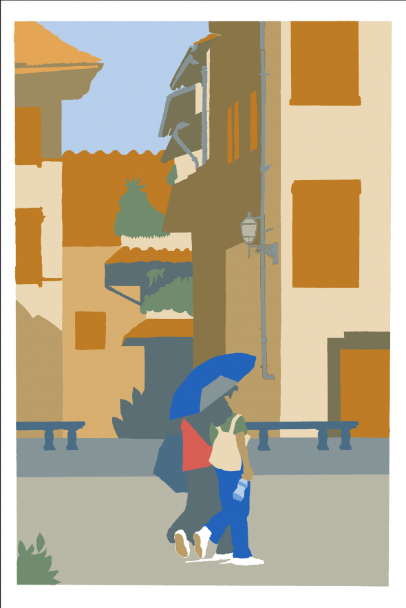
Man, color is complicated. I knew I’d have to simplify my palette–I’m not chasing realism here. Just some level of harmony. I kept it within the realm of a complementary orange and blue. I took two colors, then cut the opacity down in stages; 100%, 50%, and 20%. At those corresponding levels, I mixed the two and kept it going. I liked the result, but I wished I spent more time here.

This was a cool phase. Having the line drawing on top of the image was a pretty satisfying feeling. I’d colored sections in separate layers so that I could easily go back tweak them if needed. The image felt cohesive, but it still lacked something.

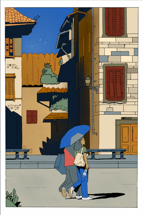
I just completely winged it here. Texture, line color, value adjustments, and light were all the variables that I messed with. I mainly focused in the background elements to see what type of impact it would have.


Click to take a closer look
My quick retrospective after making this;
Composition:
The more simplistic the drawing, the more lifting has to be done by other components. I just took a sketch and just drew over it willy nilly, which is fine for a "lets see what happens". Doing a good amount of thumbnails is an absolute for making an image. Need to spend a lot more time in here.
Drawing:
While trending in the right direction, needs refinement. Things in the bg are less defined than things in the foreground. Drawing people in this style needs more exploration before cementing on a pose. More figure drawing perhaps. Exploring the threshold of when to apply the more/less detail is hard. Hinting at textures in (ex=brick wall) is more effective than drawing the entire thing.
Color:
defining a color pallet was interesting and challenging. Using a color wheel and limiting it to complementary colors and using few colors is helpful. Also, coloring giant blocks in layers allows for an easier time seeing how color scheme flows with an image. Value study thumbnails for checking contrast would've been a lot more helpful if done beforehand and would’ve saved a ton of time.
✌🏽Till next time.